

It’s no secret wallpaper has gone in and out of style over the last century but I would argue, when chosen right, wallpaper can be timeless and tasteful. Because wallpaper is expensive and feels more permanent than paint, it’s important to watch for a few things when selecting the right wallpaper for your space.
What wallpaper you choose really depends on the space that you’re putting it in. There’s a difference between a showstopper wallpaper and a wallpaper that works more as a backdrop to your space where you can layer other patterns, artwork, etc. At W Design, we tend to install wallpaper that feels like it can be layered—these are papers that show texture and have subtle pattern without feeling too busy. However, there is always a time and a place for a show stopping wallpaper.
When searching for a timeless wallpaper, consider these four things: pattern, scale, material, and color.


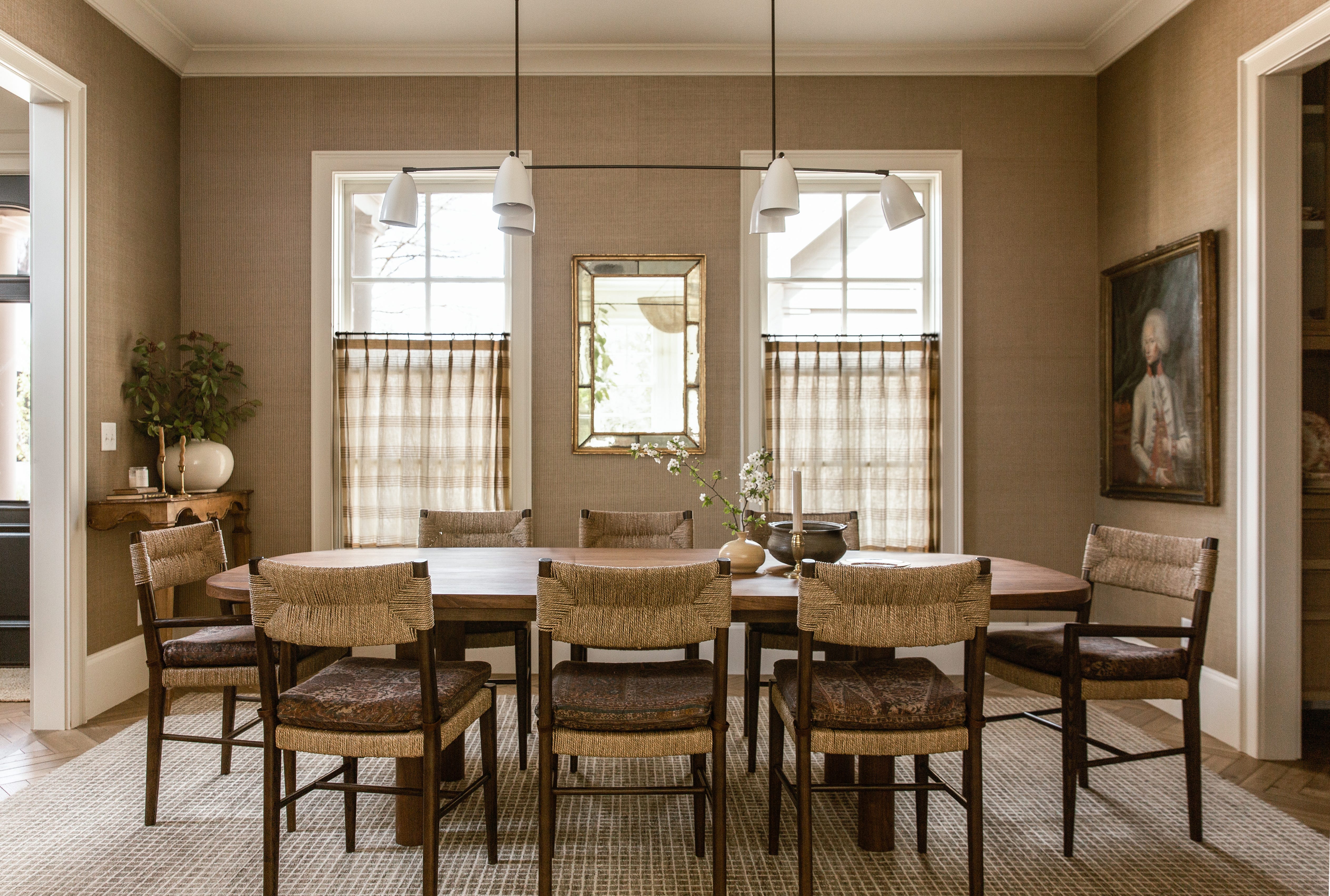
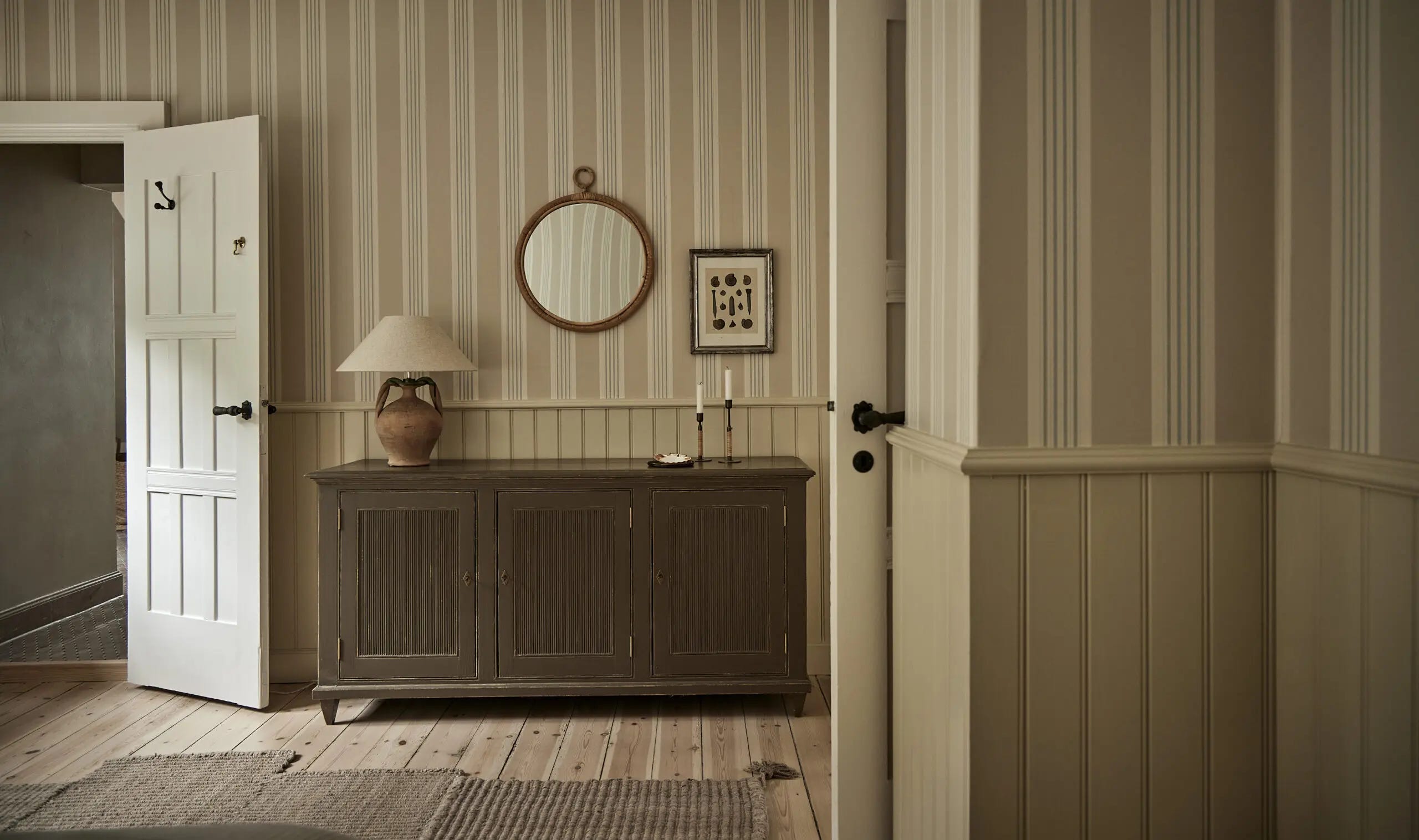
When it comes to patterns, we find that stripes, checks, plaids and even some florals will never go out of style. In terms of the scale of the pattern, we find that wallpaper with a smaller size pattern tends to feel more subtle and in turn, more timeless. Materials play a big role in the feeling of wallpaper. As with most things, we prefer natural material wallpapers like grasscloth, linens, or papers with a woven natural fiber. A word to the wise, if you do choose a grasscloth, be aware there will be seams (note my own dining room pictured above shows the variation in panels/seams) and hair like fibers that won’t be perfectly uniform. The variation is something we like about grasscloth and doesn’t deter us from using it but it’s important to point out if you aren’t familiar with the end result. Another big thing that dates a wallpaper is the color. There are some colors that are coined by certain decades (think oranges and mustard yellows in the 70s, bright neons in the 80s and all beige everything in the 2010s), and there are some colors that have always been in style and aren’t too specific to a time period. These are the colors we look for when searching for timeless wallpapers. It’s hard to describe these colors but they are often warmer and more muted (olive green, creamy tan, warm brown, english blue).
To be honest, we’ve had a hard time finding wallpaper options that we felt are both classic, timeless, but not boring. This is why we decided to create our own wallpaper collection—we wanted to create patterns and color combinations that are rooted in the past but with a nod to the present. Sharing a sneak peek of each pattern and some of the colors you’ll see throughout the collection to our loyal newsletter subscribers!
Nailing the perfect color tones and pattern scale has been a labor love to say the least but we’re so happy with the end result and cannot wait to see them in your homes! The Core Collection will be launch Summer 2024.


Loved this post! Have been agonizing over our powder bath wallpaper, wanting something I love that’s timeless and not gonna feel like “2024” in a few years down the line! Cant wait for your line to come out! Launch that blue striped check pattern early haha ;)
I love the striped paper in the bathroom you guys did! Can you share?
We added wallpaper to both our powder room and entryway. The one is timeless and the other I already want to take down!