We have had a very eventful year! Between moving offices, various site visits, 4 installs and 3 photoshoots - we’ve been busy to say the least. Last year, we were mostly heads down in designing mode so seeing the fruits of our labors has been incredibly rewarding. Many of our projects are out-of-state but we’re excited to share our Spring Creek project that is a bit closer to home, (up the street from our office to be exact) in Holladay, Utah.
After teasing the build process of this home on Instagram, we’ve never had so many paint color questions and for good reason. This home is filled with the most beautiful colors that really lend to its historic feel. As always, we will be sharing all the paint colors and different finishes throughout the home for our paid subscribers at the end of this post!
Designers: W Design Collective, Marianne Brown, Maddie Kiene, and Madeline Beck | Photography: Malissa Mabey | Builder: The Biltmore Company | Architect: Hebdon Studios
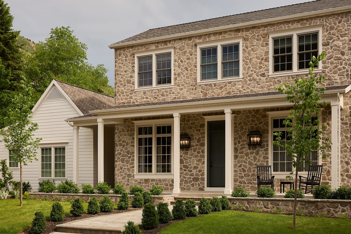
Both the design team and the homeowners wanted to create a home that felt reminiscent of the historic pioneer homes found throughout Salt Lake City. The over grout stone facade and simple English Cottage Architecture really make this home look like it has been there all along.
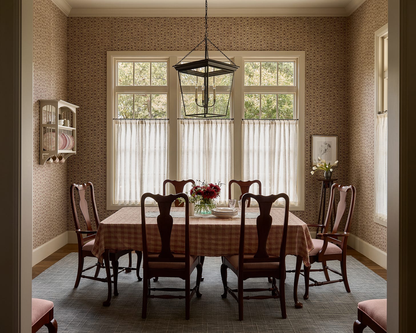
entry / dining room
The dining room is such a welcoming space thanks to the big windows and beautiful Jasper wallpaper. The clients are well-traveled empty nesters with an impressive collection of artwork and furniture that they wanted incorporated into their new home. We designed this room around our client’s existing dining set and gave the chairs new life by reupholstering the cushions with a timeless ticking stripe fabric. We always love the challenge of working with existing furniture - balancing old with new is one of our strongest strengths as a firm.
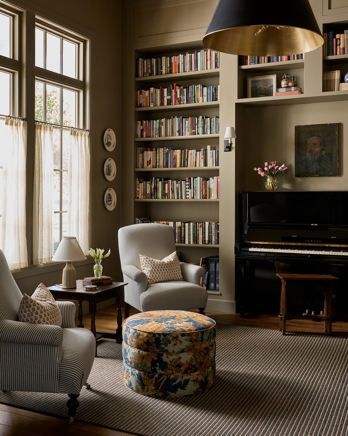
library
The budget was a driving forces to many of our design choices but together with our incredibly trusting clients (who were also interested in taking a few risks with color and pattern), we were able to make this home feel really layered, historic, and charming with deep reds, soft blues and various playful patterns used on the walls, cushions, and even on a few light shades.
pantry
I absolutely love how the pantry turned out and I’m so happy we were able to create a backdrop for our client’s whimsical collection of stoneware that she’s found on her travels. Also, we kept the microwave out for easy use because that’s real life.
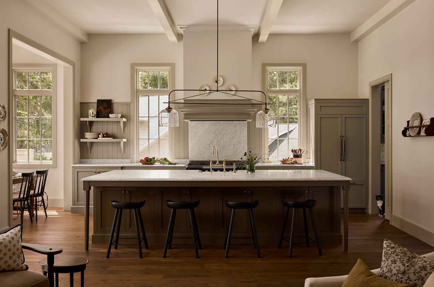
kitchen
breakfast nook
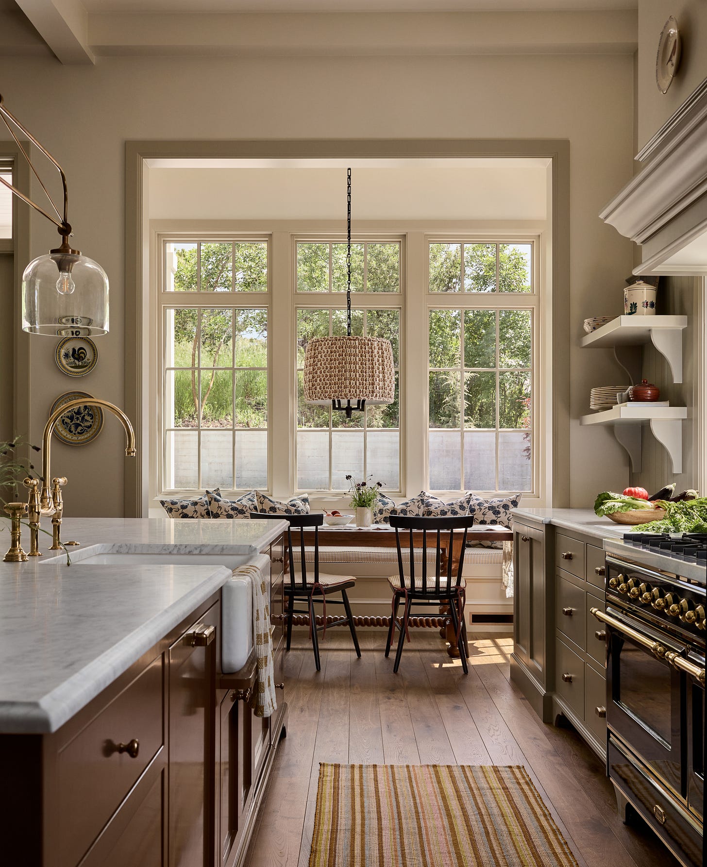
Another request from the homeowners was an enclosed breakfast nook. This view from the pantry into the kitchen is one of my favorites in the whole home. I think our team really nailed all the paint colors throughout the home but I especially love how all the different colors in the kitchen and pantry work together. The high-gloss, dark brown kitchen island felt like a big design choice but seeing it all together, it really is the thing that grounds the room.
family room
Another favorite view is this one in the family room that shows the little peek into the mudroom (we’ll share that space next week!) with the deep red floor-to-ceiling cabinets.
We’re so happy with how all the selections and design decisions came together and are sharing these details (paint, countertop, tile selections and lighting) with you, below. Let us know if you have any specific questions in the comment sections!


