
DESIGN ROUND TABLE: My Thoughts on Burled Wood, Chrome, Floral Upholstery and More
the design details we noticed everywhere at High Point and our thoughts on all of them

After our last post about High Point, I promised that I’d get into some of the design details we noticed in our next Round Table post and that’s exactly what this one is all about. But first, just wanted to share a few things happening at W Design in case you missed them, along with a few great shopping finds.
We launched 2 new light fixtures on W.D.C. Home: The Wellsley & The Bedford II. These ones were a long time coming and I am so excited to finally have them up on the site. I’m particularly excited about offering painted finishes and am dying to see someone use the Wellsley in Oak Brown or Linen Yellow (@jakearnold do you need a new fixture for your house?).
We reached #4 on the Substack Bestsellers list and I’m feeling so grateful for all of you for getting us there!
Talked about how I would approach designing homework spaces differently.
As part of our latest Hidden Cost series, we talked to a plumber and I learned about a $300 service that could save you thousands down the road. More on that here.
J Crew Pants! Did some shopping while we were in NC and found the best pants for summer. A few of us on the team bought them - the colors Sandy Hay and Fresh Cacao were our favorites (and they just so happen to be on sale).
Keep meaning to post about this again because I really think it’s that good! We have this Vetiver & Tonka Room Spray at our office and I’ve been so surprised at how much I love it - plus it’s only $16.
Now, let’s get onto some of the things we saw the most at High Point and my thoughts on all of them.
burled wood
This was one that we saw in almost every showroom that we visited, so we got to see lots of different variations and styles. Personally I really like when it’s more of a straight sheet of burled wood rather than the piece-y or tiled applications (those feel a little busier to me). It’s more of a formal look, so it’s definitely not for every project, but I think it could be really fun in an office, living room, entry, etc. I would pay attention to the tone of the wood - the blonde feels more coastal to me, while the walnut color feels a little more city/east coast and probably what I would reach for more often.


chrome
I actually really like chrome, it kind of feels like the “cool girl” accent because it’s a little unexpected. There’s something about chrome that doesn’t really fit in, which makes it feel different and unique and I think that’s why I like it. And because of that, it definitely doesn’t belong everywhere. We saw it incorporated in lots of different ways at High Point, I liked it most when it came to lighting and lamps, but we did see it on a furniture piece at Four Hands and I thought it felt really cool and almost aeronautical - you would have to have the right space for it though. I thought that the Ralph Lauren collection at Visual Comfort really hit the nail on the head with their use of chrome, pairing it with leather, it felt very masculine and a little art deco to me. It also pairs really nicely with walnuts and rich woods, I just wouldn’t put it next to a polished nickel - they fight each other.


floral prints on furniture
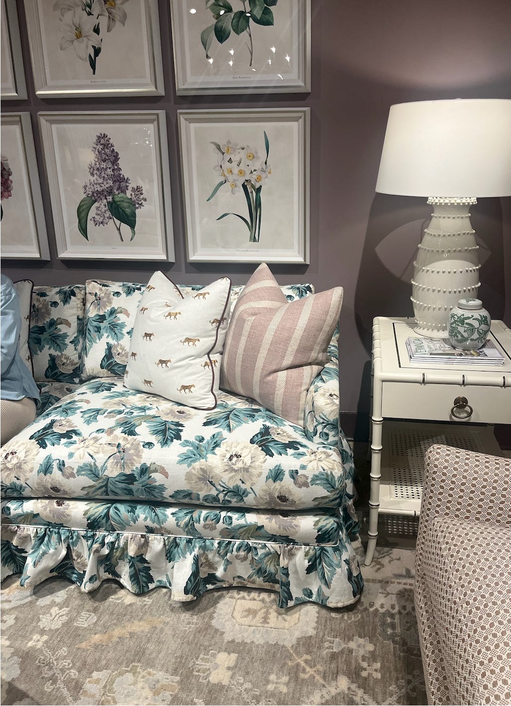
I think the days of the basic/beige sofa are slowing down, people are putting pattern back on furniture. We saw lots of variations of this (some good and some bad). I think in order to follow this trend (although I don’t want to call it a trend), it really has to fit your personality because it can be loud and I think if you’re going to lean into it, you should lean all the way in i.e. the sofa being the patterned upholstery piece in the room rather than just one chair. Or, if you don’t want to lean in all the way, I would go with something a lot smaller, like an ottoman and pillows.
A lot of what determines the success of an upholstered floral print is the print itself and the scale of the print. The two photos below are ones that felt successful to me. The pattern was the right scale and I liked that the pattern (especially on the left) felt like more of a background where you could still add pillows and style it.


The chairs below are examples of patterns that didn’t feel as successful to me. The print on the blue chair is a little bit big in my opinion, which makes it feel less refined and more loud. The same goes for the other two photos - the patterns and application just felt more trendy and not timeless.


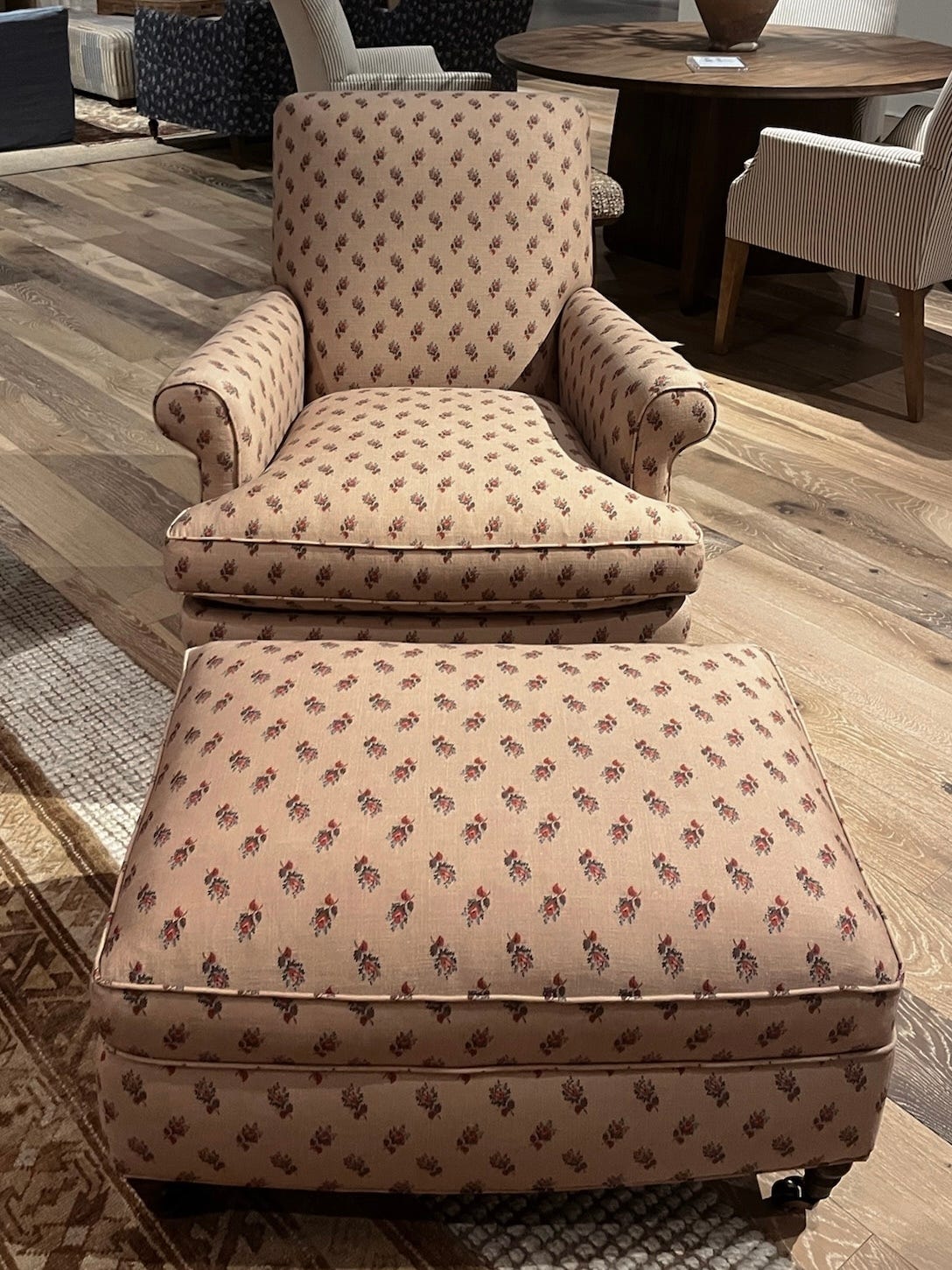
Here’s an example of a chair at Rowe that we saw that felt like it had more of an appropriate scale that felt right for the piece.
integrated bolster
When it comes to an integrated bolster, I really like the idea of putting it on a chaise or sofa. There’s something that I didn’t like as much when I saw it on a chair — it doesn’t feel as functional to me and interrupted the flow of the piece.


mushroom ottoman
We saw a lot of these (probably in almost every furniture showroom). I think they’re cute and can add a little bit of quirk and fun to a room. I personally wouldn’t invest too much money in one as I think they’re the type of thing that will be fun for 5 years and then possibly feel outdated.


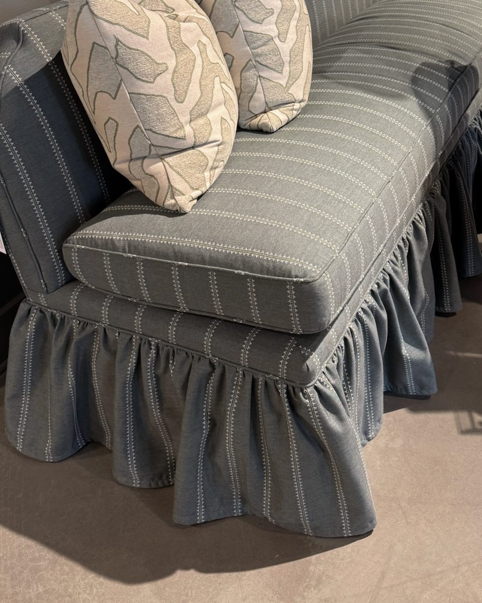
gathered sofa skirt
I know gathered skirt sofas are having a moment again, but this is a detail I would use sparingly. It feels appropriate in a girls room or on an ottoman, but I probably wouldn’t use it on a larger piece, like a sofa, unless it really fits your personality and style.
a fur chair
There was more fur at market than I expected, (especially at Verellen) and some of it I really liked. The short hair sofas looked really good and felt like really successful pieces. The application that I didn’t love was a full fur chair — there’s something about having long hair on upholstery that felt a little bit like a spider or animal to me and didn’t feel practical (think matted spots on the chair once a sticky hand touches it).


a few final details…
A few showrooms had upholstered the legs of their furniture and I love how sleek it looks.


We discovered a new upholstery line from Belgium called Collett & Victor and loved their offering. I really liked how the skirt detail on their sofas and chairs started a little lower on the sofa (it’s hard to tell in the photo, but the brown slipcovered sofa is a good example).
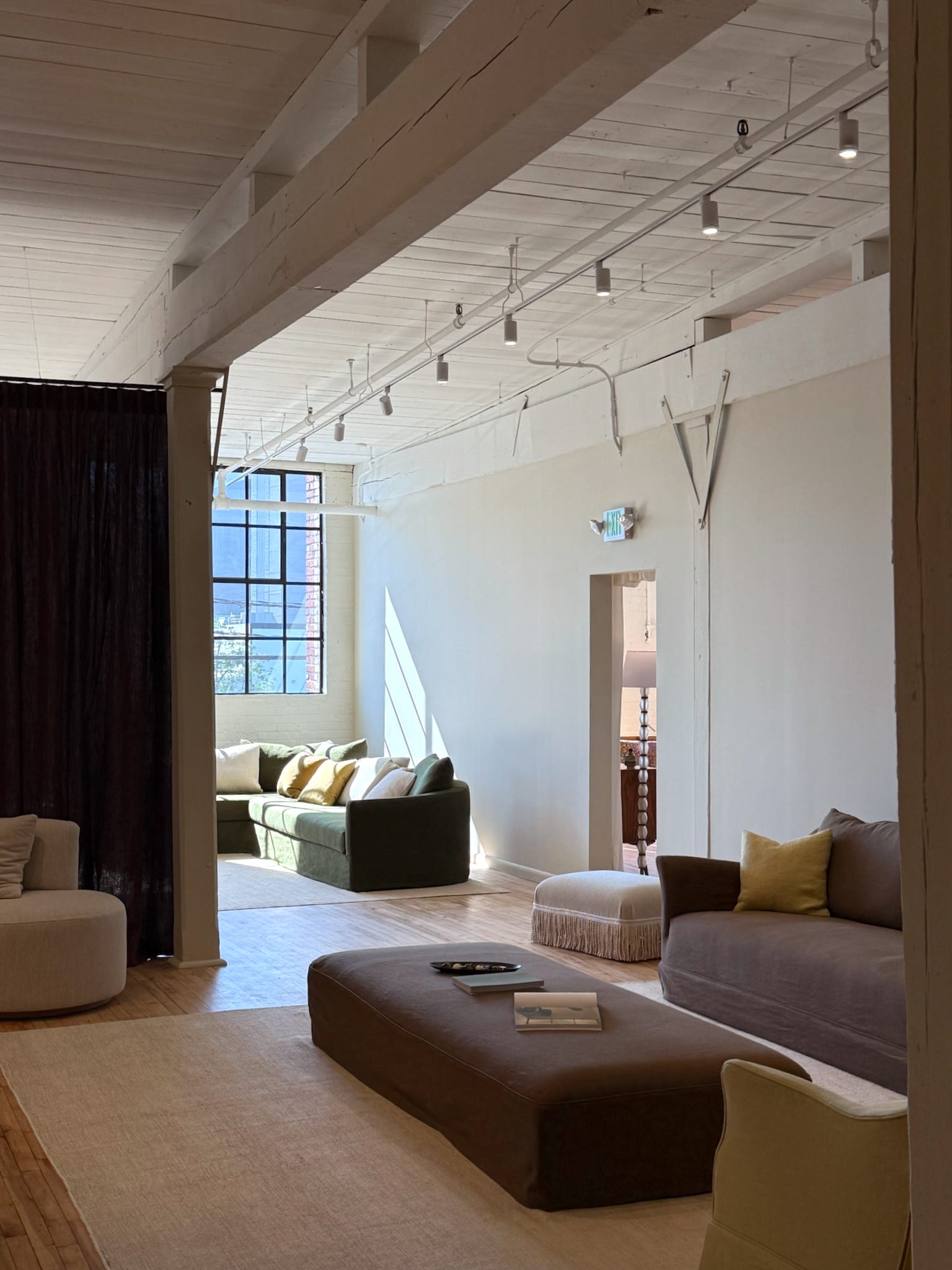
We saw a lot of great textured rugs at multiple of the showrooms that we went to. The traditional rug offering was lacking a bit and there weren’t many new offerings in that category that I was loving. When it comes to rugs I think I typically prefer a vintage traditional rug or custom, and when I order from the larger brands I like them for their basics and tried and true designs.


Hope you enjoyed this little roundup of the details that stood out to us most! I’d love to hear what thoughts you all have on these design choices or if you noticed anything else at market that we missed!
This is just so great for us who couldn’t make it! What rug companies are the above rugs from? Or what were your favorite rug companies you saw this year other than vintage? Thanks!
Thank you so much for your insightful comments. This is truly meaningful to me as I go through the process of renovating and refurnishing our home. I hope you really understand how much I your Substack!