Choosing a Paint Color To Complement The Wood Tones In Your Home
five different wood tones and the paint colors we typically pair with them
Choosing the right paint color to complement the wood tones in your home can be trickier than it seems, as it can really change the overall feel and aesthetic of a space. One of our top recommendations is to consider how you want the wood to interact with the paint—do you want them to contrast or complement each other? In other words, do you want the wood tone to stand out, or do you prefer all the colors in the room to blend? If you want the wood to feel warm, for example, pairing it with a cool color will enhance that effect. Below, we’re sharing five different wood tones, the paint colors we typically pair with them, and the thought process behind each choice. Plus, we've included a full list of our favorite paint colors at the end of this post.
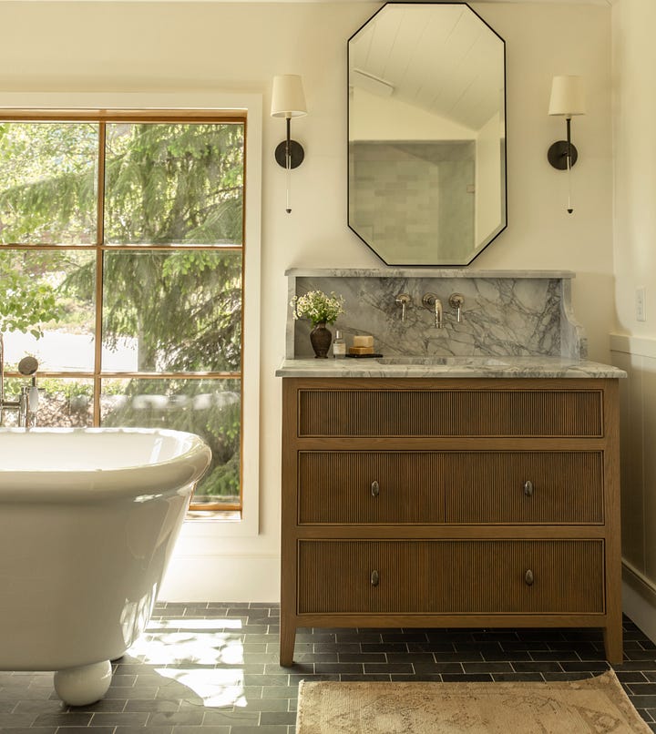
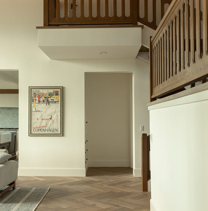
medium warm toned oak
A medium-toned oak typically has a subtle yellow or warm undertone. To complement the wood rather than contrast with it, we generally recommend pairing it with warmer hues rather than cool tones. A soft, subdued white is our go-to choice, but it also pairs well with warm greens and blues.


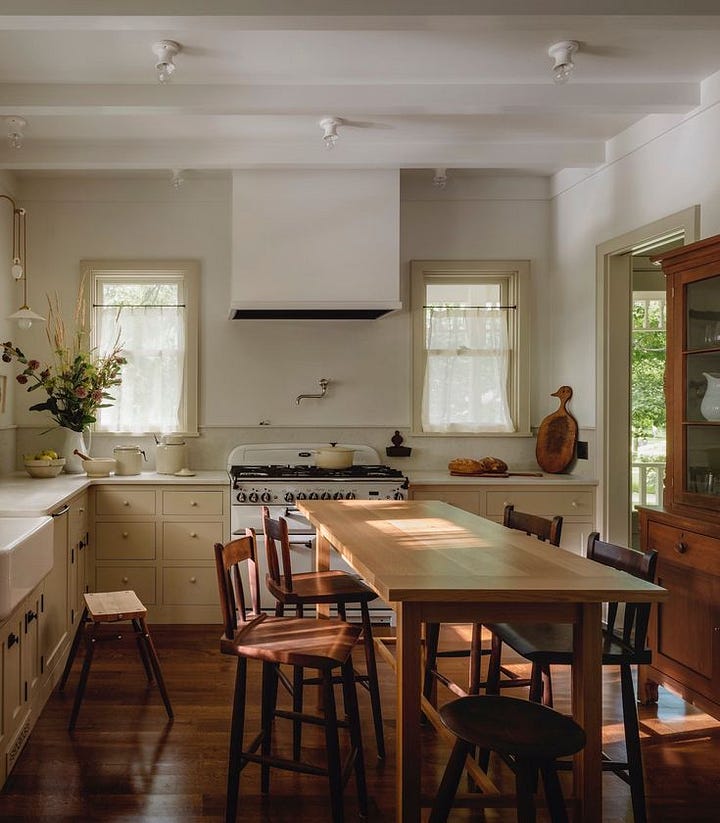
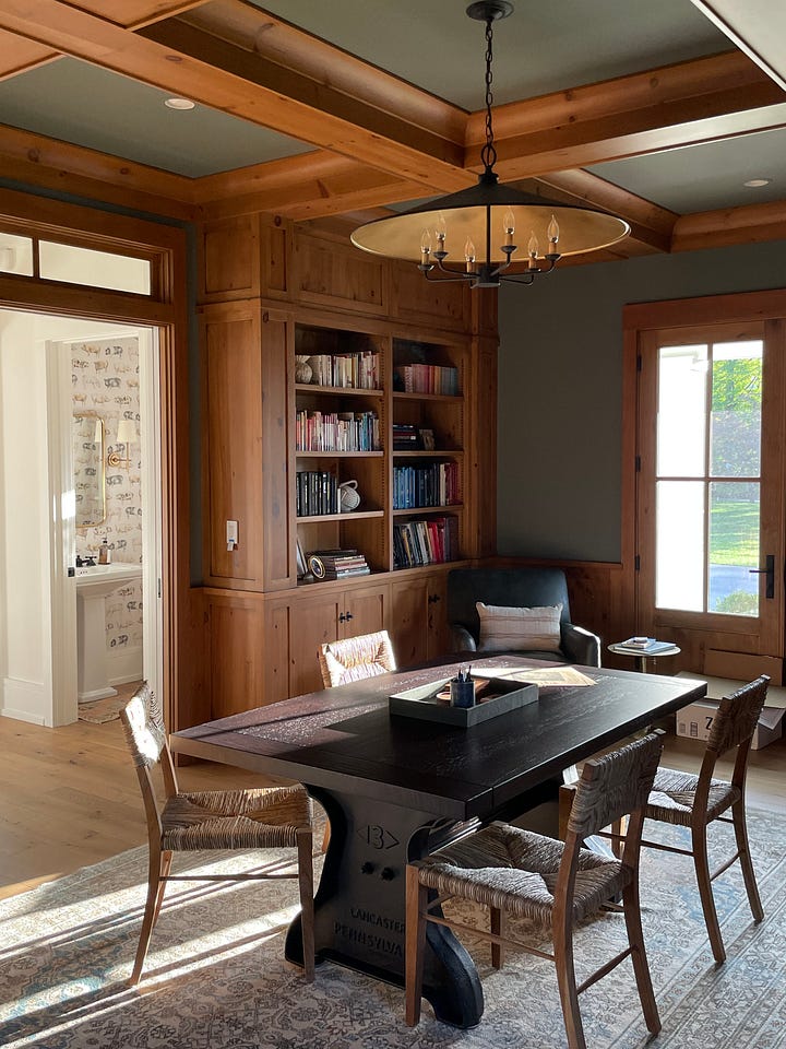
warm/orange wood
Working with warm or orange wood tones can be a bit challenging at times. When paired with a cool white paint, the wood can appear overly orange, which is a look we typically avoid. The photos below are examples of choosing paints that either neutralize or blend with those warm wood tones—such as dusty greens, blues, or soft yellow hues. I especially love how the yellow paint in the first photo complements the wood, creating a visually balanced space. The second photo, from one of our projects, demonstrates how a green paint can help tone down the yellow and orange undertones, achieving a less dramatic look.


